| HOME 2008 2009 |
|
 |
Below, are entries for my Blog/Diary. I will record my experimental work, quick sketching and maybe some venting. Click on the date tabs to expand the daily selection. |
Colour is so complex. The endless variations are possibly the most deciding factor that defines personal style. Of course drawing is very important too, more and more I find that colour choice is the first stage of painting together with blocking the compostition. I am rarely satisfied with my execution and so am focusing on colour study.
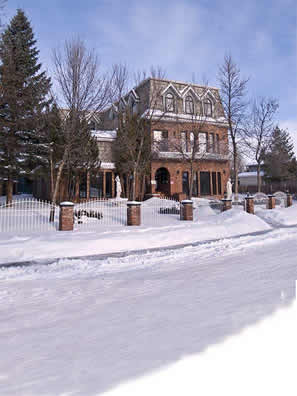
This is a winter scene with a clear blue sky (so blue has to be a main colour), a red brick house (so red is major too) and big , dark spruce trees (so now green though I would be happier with only 2 colours . . . ) Imagine my surprise to find that the camera captured the trees without a SPECK of green! Yet they look green to me. The Eyedropper tool picked up dark, barely saturated reds and purples.
|
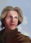
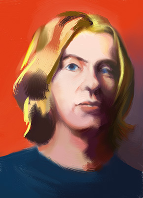
Warm and Cool Portrait StudyFlesh tones are hard to paint. Perhaps my journey with them began years ago in life drawing class. Every class I was in was always about line but I wanted to paint. Not just one pose for hours either. I mentioned this to my friend who had been educated in France and so we went to the art store and bought 6 Prisma Color pencils: 2 reds, 2 blues, 2 yellows. She explained the Impressionist colour system of warm and cool. It intrigued me and I stared analyzing what I saw in a new way. I have some of my better drawings in my Newds Gallery. That was years ago and I'm still looking for warm and cool areas. I love the way they 'pop'. With the portrait of the "Girl in the Italian Center Cafe", I became more aware of how flesh tones are actually sculpted by alternating warm and cool. I think it adds 'life' where value alone just doesn't. I decided to make the portrait very different from the source photo.
|
It all began . . .The Schwartz Family asked me to paint their family in a hypothetical situation from photos of each of them taken in different locations and with different cameras. This proved to be a challenge as when I faithfully deposited them in the scene, the painting would not balance and unite in a real way. This forced me to study other painters, other theories, re-examine warm and cool temperatures. I kept trying different techniques such as 'lost and found line' which helped enormously, but I kept having to return to temperature. After 17 versions I began to get very confused. The rule of thumb for this technique is that warm colours advance and cool colours rececede. This didn't work in some areas and I couldn't understand why. There was some other factor which flipped the rule on it's head. One day, talking with an accomplished portraitist, I asked him about this. He said the rule flips when subject has a warm rather than cool background. So these are tests of that principle. |
Bryn from the Italian Center Cafe
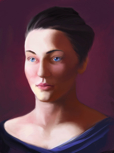
This next effort revealed how the face must be sculpted very subtly with minute changes in temperature. Again, something is definately lacking. The background was deliberately dark and I have been studying Rembrandt's women portraits for temperature and contrast. There are many redeeming features in this portrait although I find it way too literal an interpretaion with the lighted cheek too pink - the flesh too saturated generally and the eyes too defined. Again, the source photo was not the best. I had tremendous fun painting though! It reminds me of Freida Callo's portraits of herself. |
|
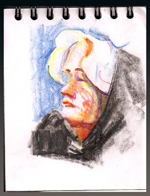
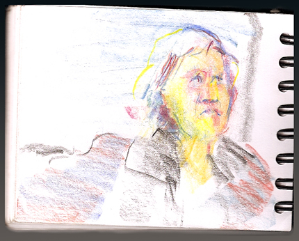
It was a brilliantly sunny day. The kind that we get in Edmonton in January when it's 21 below. Cabin fever must have impelled me to choose to explore the local bus routes. Being who I am, I took my colours and a small sketch pad. When I told my Mum my plan, she astutely asked, "Won't it be too bumpy?" Hmmmmm . . . didn't think about that. It's been so long since I rode a bus. Oh well . . . the challenge might produce interesting results! The challenge of the ride was small compared to the skill required to actually catch the bus . . Arrive on time . . . for the right bus . . . going in the right direction. Navigating public transit is a skill! As you may have guessed, I did all of the above - backwards - missing the bus to the central, western hub: West Edmonton Mall with the cozy, heaters. "When does the next bus stop here?" I asked a departing passenger. "Half an hour." Then added after seeing my shocked face, "If you walk to 178 Street, there will be about 5 buses going to the Mall." The temperature decided me and I noted my knees and face gradually freezing during the 10 minute hike. Luckily, a bus arrived promptly. I had set my detination as the Whitemud Library near the middle of the south side of Edmonton and had learned the route number from the website: the #33. In ten minutes, I was seated and had my colours and paper discreetly in hand. No one ever knew they were models!
|
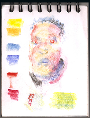
I have been fascinated with the Impressionist Palette for some time. It provides a limit of 6 colours which are easily held while drawing and it's so engrossing to analyze what I see into warm and cool red, yellow and blue. I was sitting beside a 5 year old girl who became totally engaged with naming each colour and whether each colour was the same or different, darker or lighter. Hence the swatches on sketch above.
|
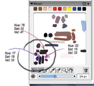
 I was working on a Home Portrait - roughing it in with big, smeary bristle brushes as I like to do, sampling colour from the source photo and daubing the main choices on the Mixer Pad.
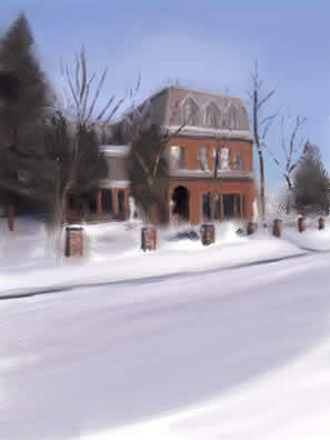
 CJ
CJ 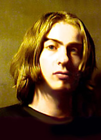
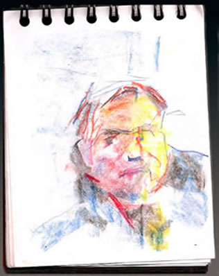 Yes, it was bumpy! But not unbearable if one's expectations were . . . not high . . .